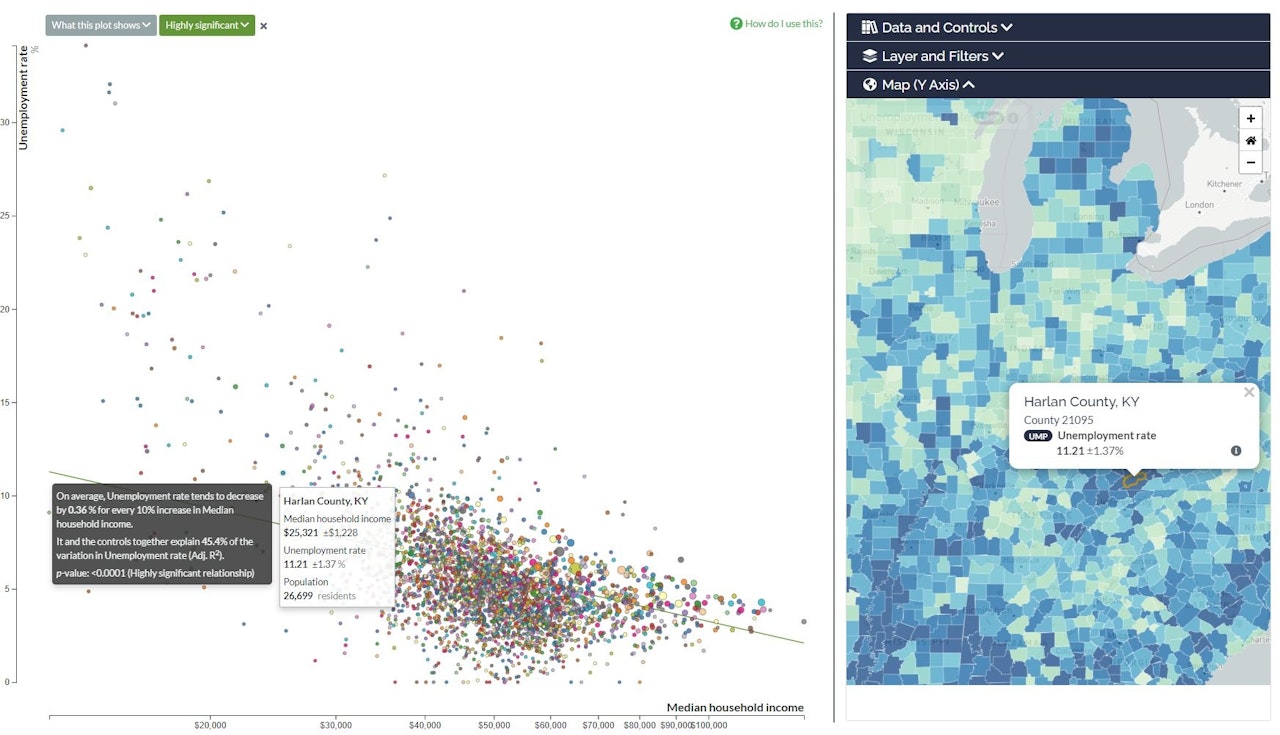

What does the scatterplot show?
The scatterplot shows how values of one topic tend to correlate with (increase or decrease at the same time as) values of another topic, among a group of places.
There could be many reasons for this correlation:
- The effect is real: one topic really does influence another. For instance, unemployment and income.
- The effect is due to some hidden covariate topic that affects both X and Y. For instance, the scatterplot may show a positive correlation between high property values and good health. However, property values do not directly affect health: instead, high income and wealth in a neighborhood may translate into both more expensive housing and better health outcomes.
- The effect is due to random chance or magical effects. For instance, emergency department visits and the phases of the moon. Even if a correlation exists, it is safe to assume (in this world) that it is not real.
